


Typography is the art and science of arranging type to make written language legible, readable, and appealing. In the digital age, where our lives are entwined with screens and web content, typography has become an essential component of design.
Every website you visit, every app you use, and every document you read involves typography in some way. Understanding typography and how fonts work together is crucial, especially for web designers and content creators.
If you're new to the world of typography and web design, this blog post is your gateway to font mastering and font pairing. We'll unravel the mysteries of fonts, exploring their different classifications, weights, and styles.
We'll delve into the importance of font pairing and discover how the right combination of fonts can significantly impact the aesthetics and functionality of your website.
Understanding Fonts
Typography, the art of arranging type, plays a pivotal role in design, especially in web design. Fonts are the building blocks of typography, and understanding them is essential for creating visually appealing and effective content.
In this section, we'll explore font type classifications and key typography terms that will serve as the foundation for font pairing.
Font type classifications
Fonts are categorized into various types, each with its own distinct characteristics. Let's examine the primary font classifications:
Serif fonts:
Serif fonts are characterized by small decorative strokes, or serifs, at the ends of the characters.
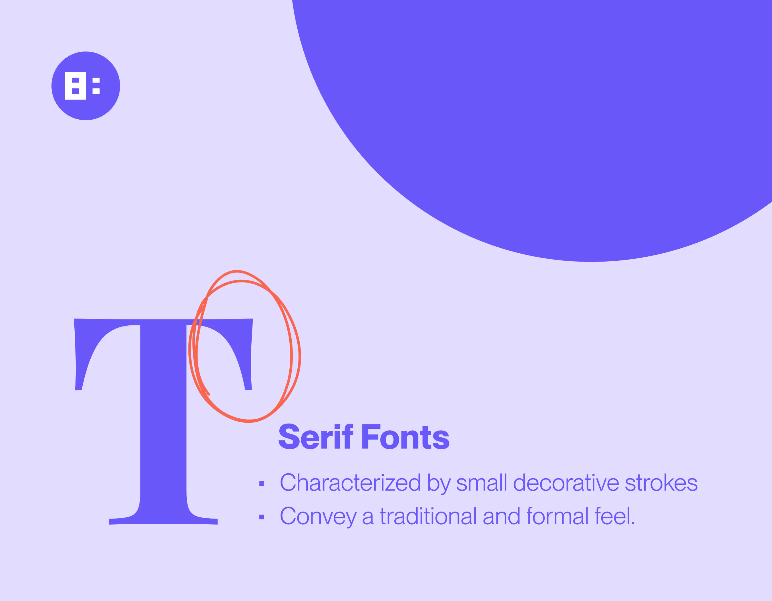
These fonts often convey a traditional and formal feel. They are commonly used for printed materials like books and newspapers.
Sans serif fonts:
In contrast to serif fonts, sans serif fonts lack those decorative serifs.
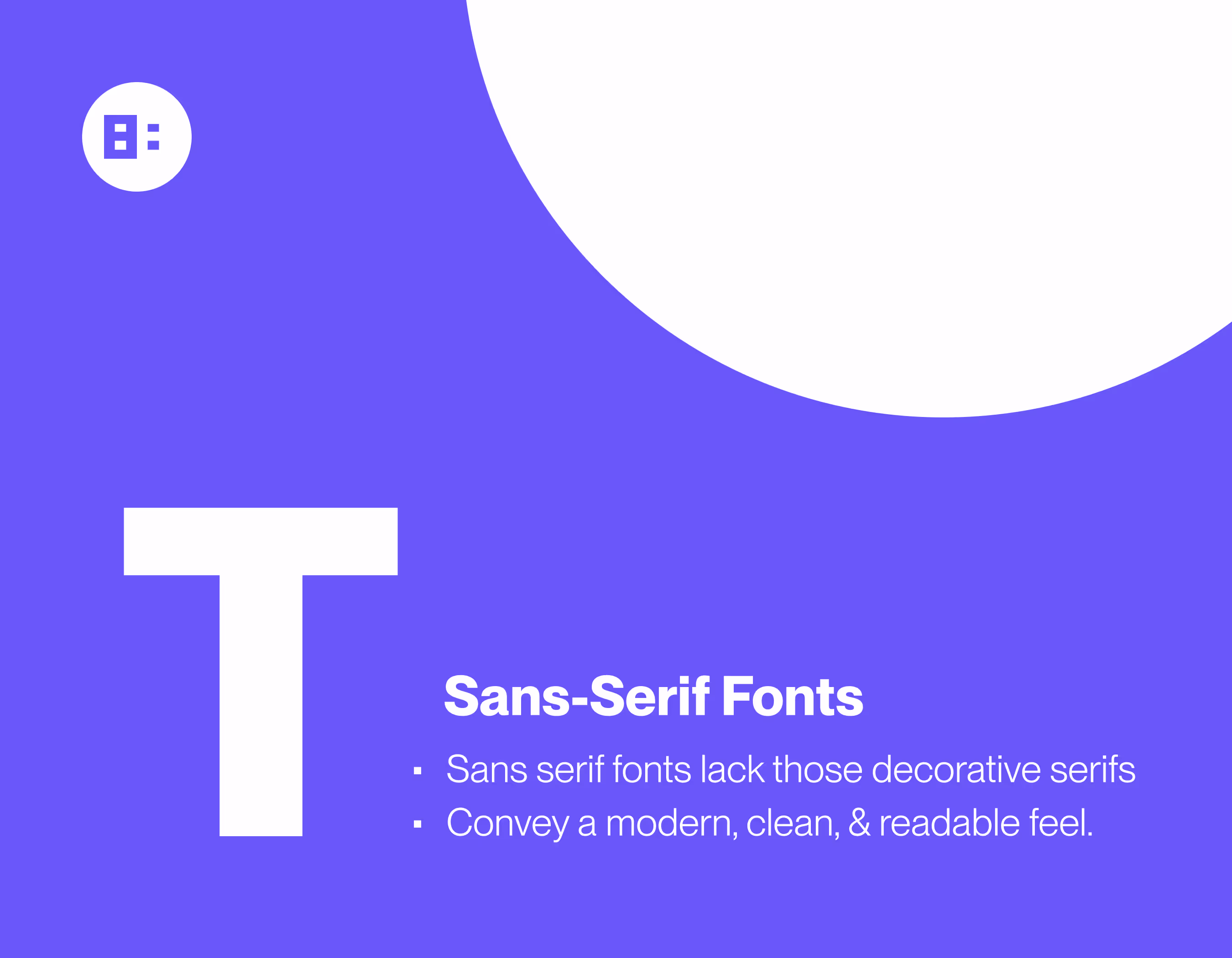
They are often considered more modern, clean, and readable. Sans serif fonts are prevalent in digital media and web design.
Slab serif fonts:
Slab serif fonts have bold, block-like serifs that give them a distinctive, sturdy appearance.
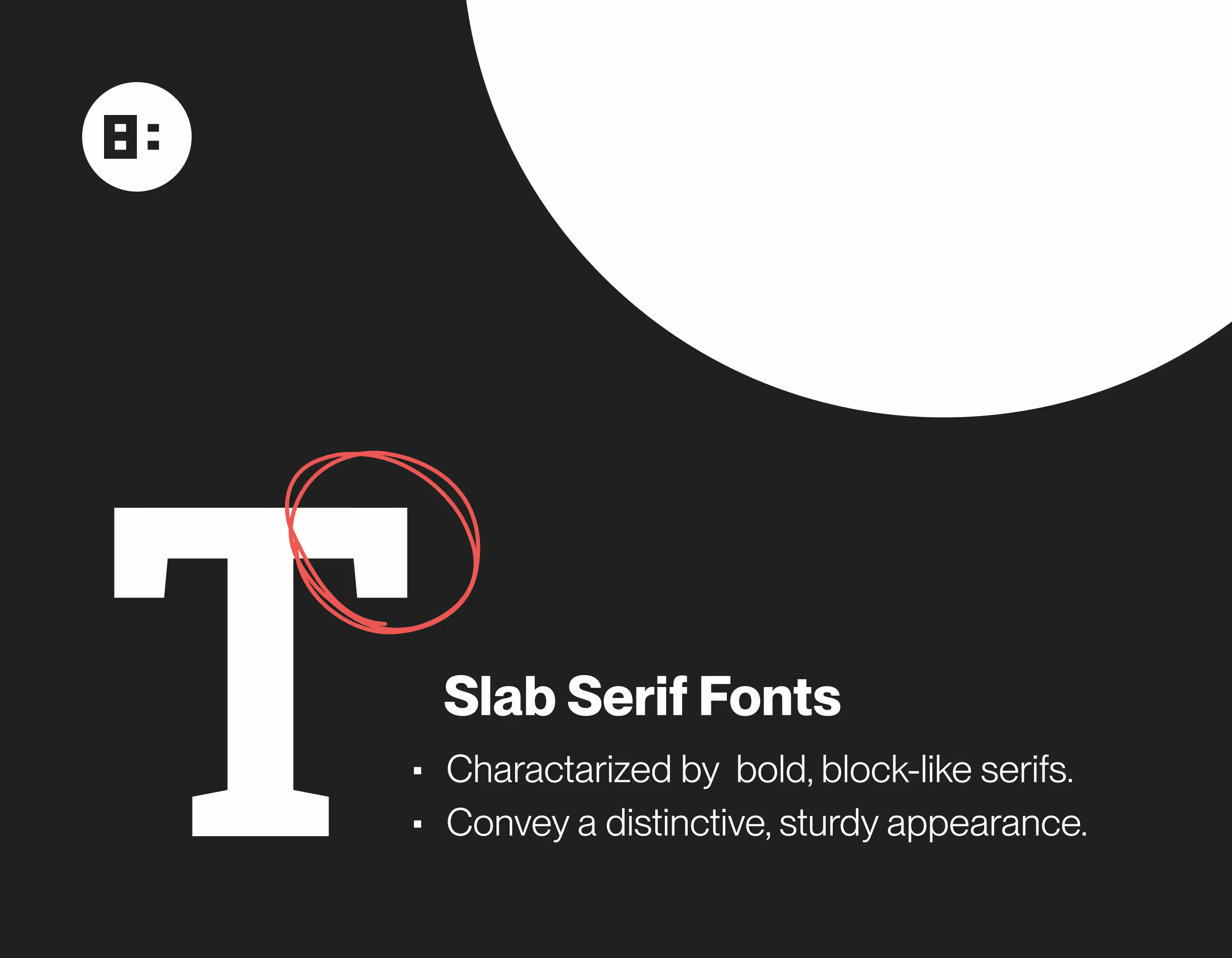
They strike a balance between the formality of serifs and the modernity of sans serifs, making them suitable for headlines and logos.
Decorative fonts:
Decorative fonts are highly stylized and unique.
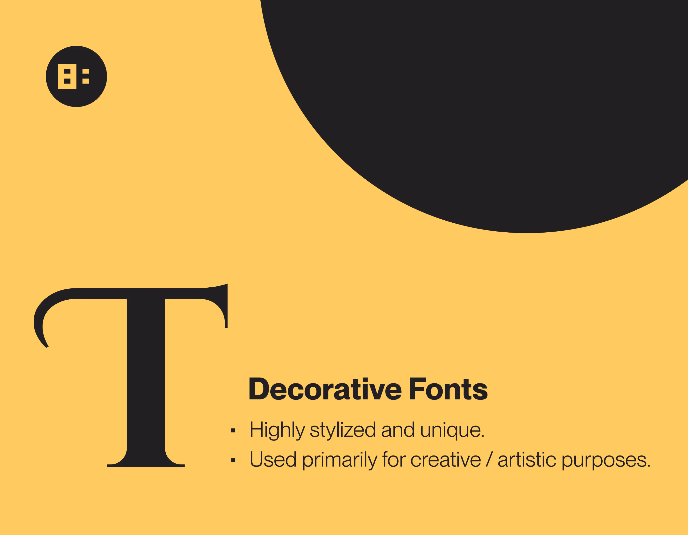
They are used sparingly and primarily for creative or artistic purposes, as their readability can be compromised.
Script fonts:
Script fonts mimic cursive or handwriting styles.
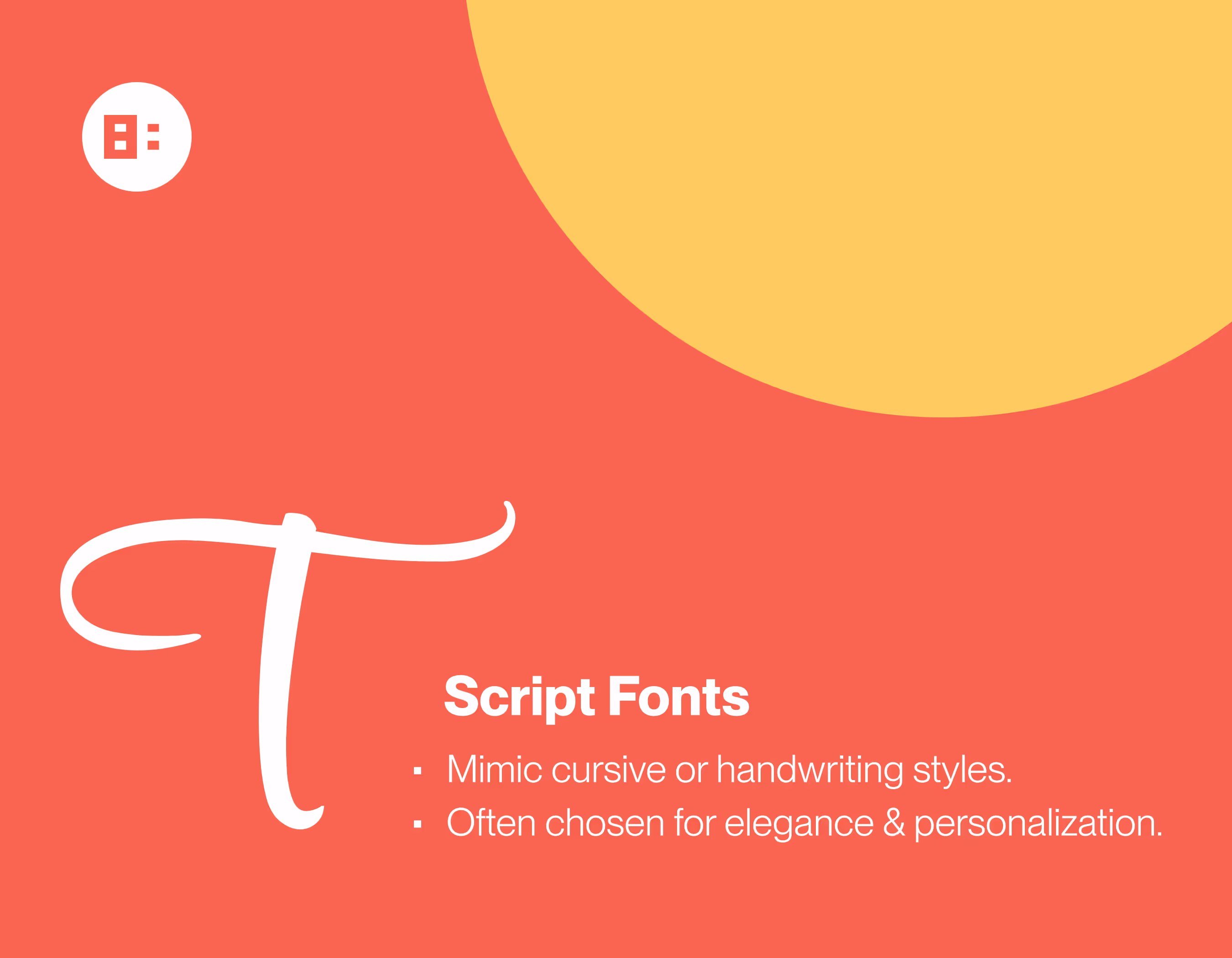
They are often chosen for elegance and personalization but should be used with caution for body text due to potential readability issues.
Typography terms
To comprehend fonts fully, you should also be familiar with some essential typography terms:
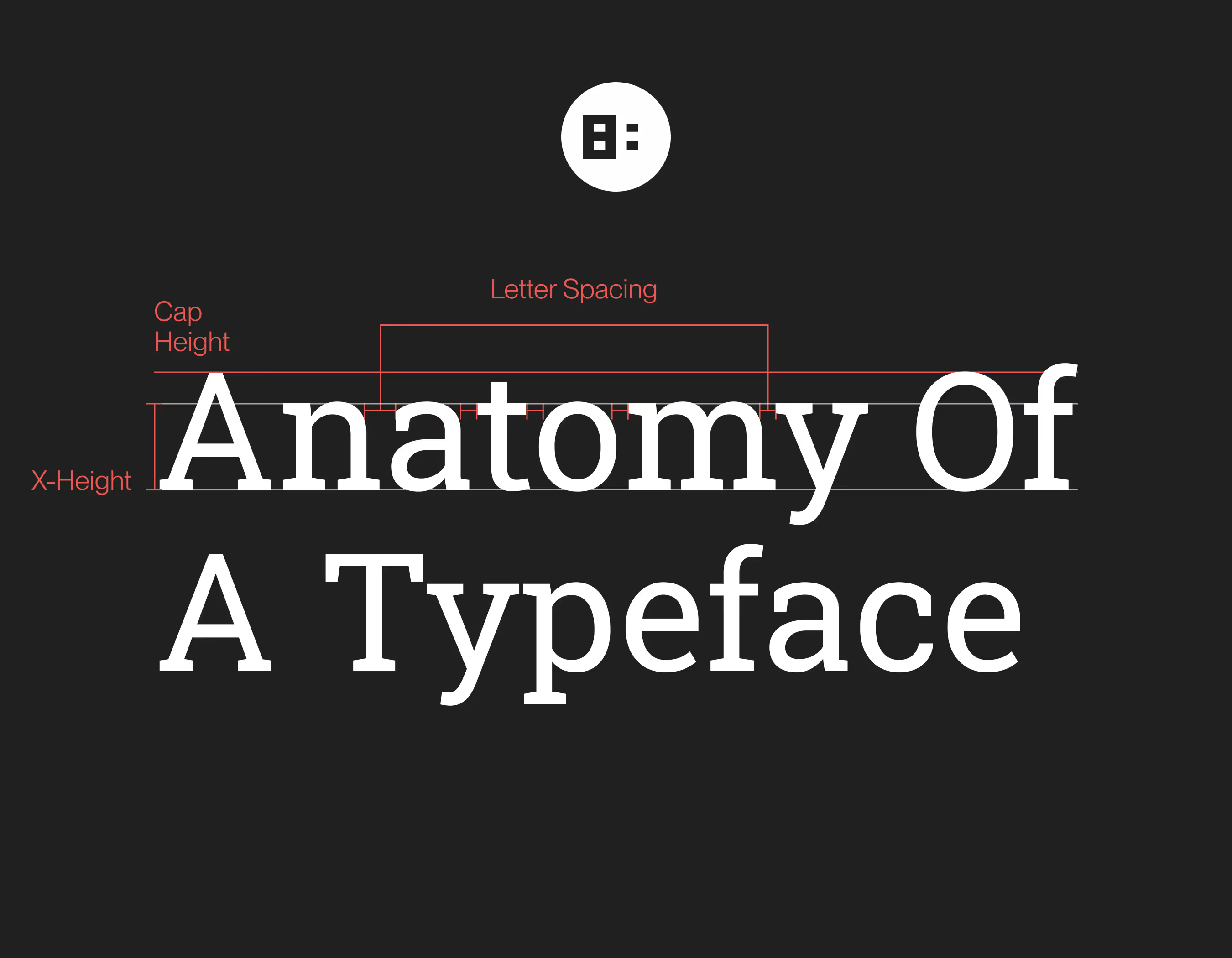
- X-Height: refers to the height of the lowercase "x" in a font. It's a critical factor in determining a font's readability and legibility. Fonts with a larger x-height are often easier to read.
- Concord: in typography, refers to the overall visual harmony and compatibility between fonts used in a design. Achieving concord ensures that the selected fonts work well together and maintain a cohesive look.
- Contrast: pertains to the difference in stroke thickness within a font. High-contrast fonts have noticeable variation between thick and thin lines, while low-contrast fonts maintain a more uniform stroke.
- Font weight: signifies the thickness of the characters within a font family. Fonts can range from light to bold, and this variation plays a crucial role in creating emphasis and hierarchy in your design.
- Hierarchy: Typography hierarchy involves using different font sizes, weights, and styles to emphasize and organize content. It guides the reader's eye, allowing them to navigate through the information more efficiently.
- Styles: within a font family can include variations such as italic, bold, or bold italic. These styles offer flexibility in how text is presented.
- Structure: Font structure describes the arrangement and consistency of characters. Some fonts have a more geometric or formal structure, while others may appear more organic and free-flowing.
What Is Font Pairing?
The concept of font pairing is a design strategy that involves selecting and combining two or more fonts in a way that creates harmony, contrast, and readability within a design or layout.
Font pairing is more than just picking fonts that look good together; it's a deliberate choice that can significantly impact the aesthetics and effectiveness of your design.
The role of font pairing in design
Font pairing plays a crucial role in design for several reasons:
- Aesthetic appeal: Well-paired fonts can enhance the overall visual appeal of your design. The right combination can make your content more engaging and memorable.
- Establishing hierarchy: Font pairing is a powerful tool for establishing a hierarchy within your content. By using distinct fonts for headings, subheadings, and body text, you can guide the reader's eye and communicate the importance of each element.
- Brand consistency: For businesses and organizations, consistent font pairing can contribute to brand identity. By using the same fonts across various materials, from websites to marketing collateral, you reinforce your brand's personality and recognition.
- Readability and legibility: Different fonts have varying levels of readability and legibility. The right font pairing ensures that your text is not only visually appealing but also easy to read, which is crucial for user experience.
- Emotional impact: Fonts can convey emotions and feelings. The choice of fonts can influence how your audience perceives your content. For example, a playful script font may evoke a different emotion than a classic serif font.
- Creating contrast: Font pairing can create contrast in your design, making specific elements stand out. For instance, using a bold sans-serif font for headlines and a clean serif font for body text creates a clear distinction.
Why Is Font Pairing Important in Web Design?
In web design, font pairing emerges as an essential art form, far more significant than mere aesthetics. The digital age has transformed the way we consume information.
With the majority of content being delivered online, the role of typography in web design has taken center stage. Typography directly affects the user experience. Here's why font pairing is especially important in web design:
Typography and user experience (UX)
Typography is the voice of your content on the web. It conveys the message, sets the tone, and connects with your audience. Font pairing, the strategic selection of typefaces, is the harmonious orchestra that can make this voice a captivating symphony or a discordant noise. Here's why it's indispensable:
1. Readability and engagement:
Online, your words must captivate, inform, and guide visitors efficiently. If your text is hard to read due to improper font pairing, your message becomes lost in translation. Visitors need to absorb content with ease and pleasure.
Well-paired fonts ensure readability, which in turn encourages user engagement.
2. Navigation and user-friendliness:
Websites are like digital journeys, and fonts are the signposts. Consistent font choices for headings, subheadings, and body text help users navigate seamlessly.
Users should intuitively know where to look for specific information. Font pairing aids in organizing content, simplifying the user's journey, and ensuring they have a pleasant experience.
3. Accessibility:
Web designers bear the responsibility of inclusivity. Not all visitors have perfect vision. Font choices can dramatically impact accessibility.
Opting for fonts that are legible, and providing sufficient contrast between text and background, is fundamental for ensuring that every user can access your content.
4. Trust and credibility:
Your website is often the first interaction users have with your brand or content. A visually appealing and well-structured presentation of text breeds trust and credibility.
A haphazard arrangement may lead users to question the reliability of your content. It's no exaggeration to say that fonts play a role in your site's first impression.
5. Visual hierarchy:
The user's attention is a valuable commodity. Font pairing is a powerful tool for establishing visual hierarchy. Different fonts can be used strategically to draw attention to key points, conveying to the user what is most important.
This hierarchy not only assists in user comprehension but also supports the user's interaction with your content.
Consistency and branding
In web design, consistency is synonymous with professionalism. Fonts are pivotal in maintaining brand identity, recognition, and customer loyalty:
1. Brand identity:
Fonts are as much a part of your brand's identity as your logo or color scheme. Consistency in font pairing across your website solidifies your brand's identity and fosters recognition. When users encounter your fonts in other contexts, such as marketing materials, they instantly associate them with your brand.
2. Professionalism:
A website with inconsistent fonts may appear disjointed and unprofessional. Consistent font pairing and typography choices indicate a high level of care and organization in your design. This, in turn, boosts your brand's reputation.
3. Emotional connection:
Fonts can convey emotions and feelings. Selecting the right fonts can create an emotional connection with your audience and reinforce your brand's values. Whether you want to evoke trust, warmth, or innovation, font pairing can help convey your brand's message.
4. Memorability:
Well-paired fonts make your website memorable. A distinctive, well-thought-out typography style sticks in a visitor's mind. When your fonts are unique and distinct, visitors are more likely to remember your site and return for future visits.
Choosing Fonts
Selecting the right fonts for your design is one of the most important steps in achieving a visually appealing and effective typographic composition.
What fonts go well together?
Fonts, like people, have different personalities. Some are formal and elegant, while others are casual and friendly.
The key to successful font pairing is finding typefaces that share common attributes or offer intriguing contrasts. Here are some principles to consider when choosing fonts that go well together:
Contrast and harmony:
Seek a balance between contrast and harmony. Pair a bold, attention-grabbing font with a more subdued, readable one to create interest while maintaining readability.
Consistency:
Choose fonts that align with your content's purpose and your brand identity. For example, if you're designing a legal website, a playful and whimsical font may not be suitable.
Complementary styles:
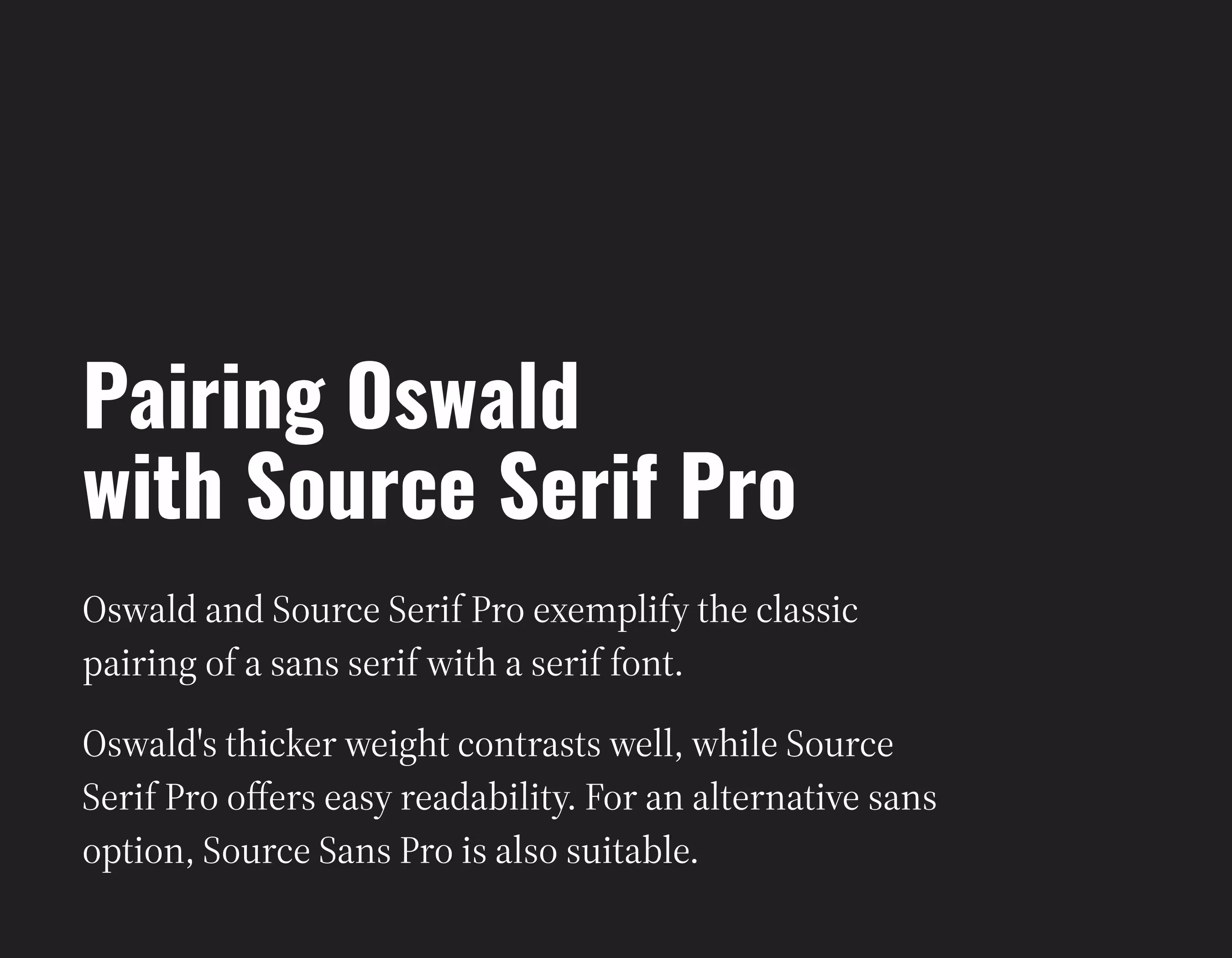
Pair fonts from different classifications. A common approach is to combine a sans-serif font with a serif font. This creates visual variety while preserving readability.
Scale and hierarchy:
Consider font size and weight. Headings should be more substantial and bold to capture attention, while body text should be legible and clear. Keep a consistent scale throughout your design.
Alignment with message:
Your font choice should align with the message and emotion you want to convey. For example, a fun and lively script font may work for a children's website, but it wouldn't be appropriate for a corporate finance site.
Avoid overcrowding:
Don't use too many fonts in one design. Limit yourself to two or three fonts to maintain a cohesive look. Overusing fonts can lead to a cluttered and chaotic design.
How to choose complementary fonts
The process of choosing complementary fonts involves a bit of experimentation and intuition. Here are some steps to guide you. The key is to experiment with different fonts and see which one works best for you.
- Start with a purpose: Begin by understanding the purpose and content of your design. What message do you want to convey, and who is your target audience?
- Consider brand guidelines: If your design is part of a brand, consult any existing brand guidelines. They may specify certain fonts or styles to maintain consistency.
- Pair a serif with a sans serif: One common approach is to pair a serif font with a sans-serif font. The contrast between the two often creates an appealing balance.
- Use online tools: Several online tools and resources can help you experiment with font pairings. Websites like Google Fonts or Adobe Typekit offer font combinations and allow you to preview them in your design.
- Test for readability: Always ensure that your font choices are readable. Avoid fonts with excessively ornate or condensed characters that may hinder legibility.
Three most common font styles
While there are numerous font styles to choose from, three of the most common and versatile categories are Serif Fonts, Sans Serif Fonts, and Script Fonts.
Rules of Font Pairing
Font pairing, while a creative endeavor, also has some essential rules that ensure your design remains cohesive and visually appealing. Let's explore these rules:
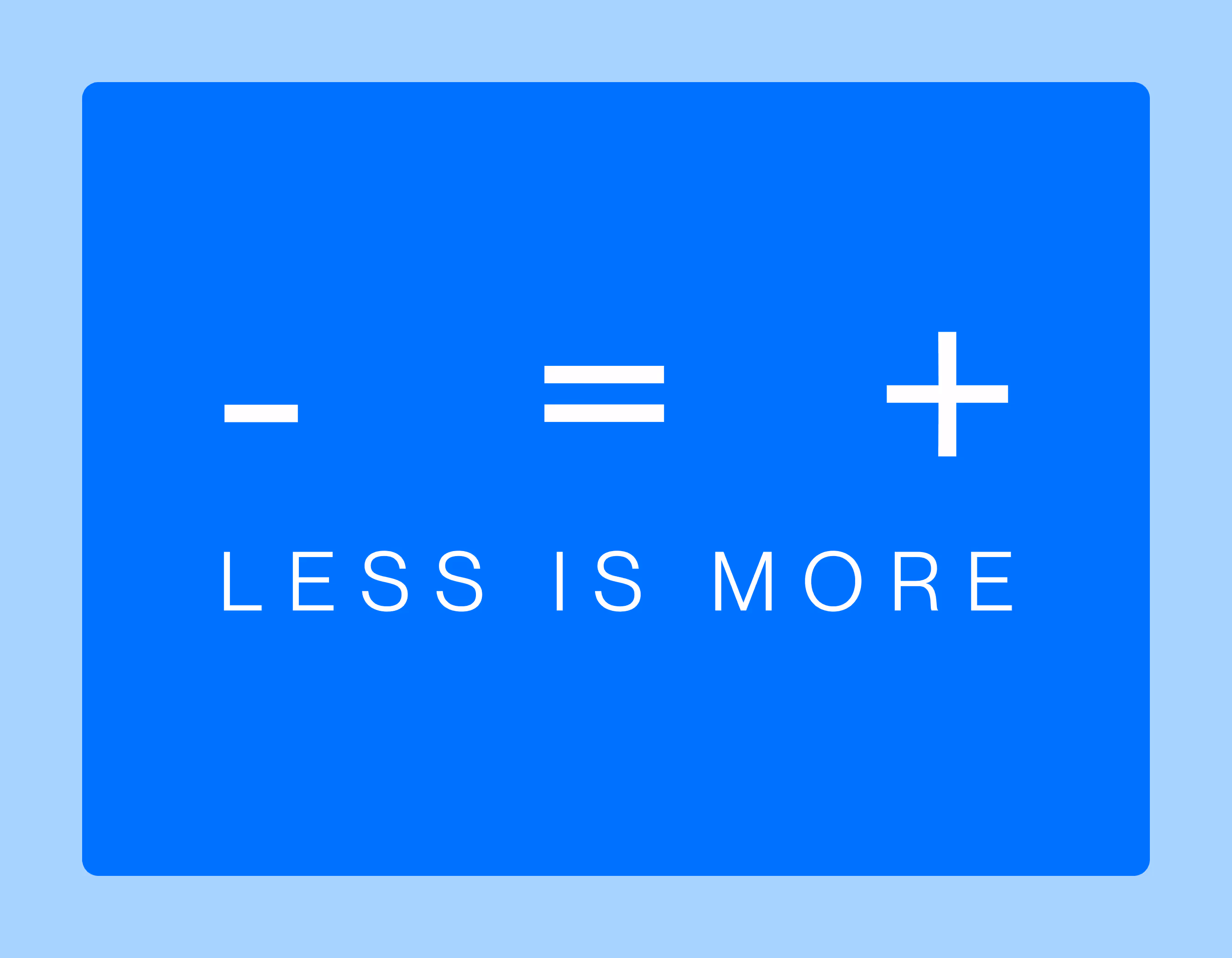
1. Limiting the number of fonts:
Less is often more in font pairing. Avoid the temptation to use a multitude of fonts in a single design. As a general guideline, it's recommended to limit your font choices to two or three typefaces. This restriction promotes visual consistency and prevents your design from becoming chaotic or confusing.
- Hierarchy: Establish a hierarchy of fonts within your design. For example, one font for headings, another for subheadings, and a different one for body text. This helps guide the reader's eye and reinforces the structure of your content.
- Exceptional use: If you wish to use a unique font for a particular purpose (like a logo or a distinctive section), it's okay to introduce a fourth font sparingly. However, ensure it aligns with your design's overall aesthetic.
2. Emphasizing contrast over conflict:
Font pairing should create contrast while avoiding conflict. Contrast can be achieved through variations in font styles, sizes, and weights. Contrast guides the reader's attention, emphasizes key points, and maintains interest. However, it's important to strike a balance to prevent fonts from clashing or competing.
- Legibility: Ensure that font contrast doesn't compromise legibility. For example, avoid pairing two overly decorative or ornate fonts, which might make the text difficult to read.
- Visual harmony: Aim for a harmonious coexistence of fonts. Fonts should enhance the content, not distract from it.
3. Proper sizing and shaping:
Font sizing and shaping, including boldness or italics, contribute to readability and hierarchy within your design. Here are some considerations:
- Sizing: Maintain consistent and logical font sizing. Headings should be larger than subheadings, which, in turn, should be larger than body text. This consistent scaling guides the reader and supports the visual hierarchy.
- Font weight: Adjust the weight (thickness) of fonts to emphasize content. Bold fonts can be used for headings or to draw attention to specific elements, while lighter weights work well for body text.
- Italics and styles: Reserve italics or other styles (e.g., underlining) for specific purposes, such as indicating book titles or emphasizing a word or phrase. Avoid excessive use, as it can lead to visual clutter.
Font Pairing Tips
Font pairing is an art that combines creativity and strategy. These tips will help you make informed decisions when selecting and combining fonts for your design:
1. Prioritizing readability and legibility:
Your design may look stunning, but if users struggle to read the content, the aesthetics lose their value. Here's how to prioritize readability and legibility:
- Consider X-height: Fonts with a larger x-height (the height of lowercase letters) are often more readable on screens.
- Test for legibility: Always test your font choices for legibility, especially on various devices and screen sizes. If the text isn't easily readable, it may deter users.
- Line spacing: Appropriate line spacing (leading) is essential for readability. Avoid crowding text together, and ensure there is enough space between lines to make reading comfortable.
2. The timelessness of classic fonts:
Classic fonts, such as Helvetica, Times New Roman, and Arial, have endured the test of time for a reason. They offer a level of timelessness and versatility that works well across various design contexts.
Foundation with classics:
Start your font pairing with classic fonts as a foundation. They can serve as a reliable and neutral base for your design.
Modernize with complementary fonts:
Pair classic fonts with more modern or distinctive typefaces to add a touch of uniqueness to your design without compromising readability.
3. Serif vs. Sans Serif comparison:
The debate between serif and sans-serif fonts is a classic one. Both have their strengths, and combining them can create an excellent contrast. Here's how to make the most of this pairing:
Headings vs. body text:
Serif fonts are often used for headings due to their elegant and traditional appearance. Sans-serif fonts are generally preferred for body text for their clarity and modern feel.
Consistency:
While contrasting fonts can work well, ensure that fonts within each category (serif or sans-serif) are consistent. Inconsistencies within a category can disrupt the overall design.
4. Checking glyphs for special characters:
When choosing fonts, don't forget to consider special characters and glyphs beyond the basic alphabet and numbers. These can be crucial for certain design elements:
- Check language Support: Ensure your chosen fonts support the languages you plan to use in your design. Some fonts may lack characters for languages other than English.
- Symbols and icons: Consider whether your fonts include the symbols and icons you may need for your design. Some fonts have a rich set of special characters that can enhance your content.
- Custom ligatures: Some fonts offer custom ligatures for character pairs. These ligatures can provide a more polished and artistic look to your text.
Summary
Font pairing is the unsung hero of web design, an essential skill in the toolkit of typography for beginners. It's the careful selection of fonts that not only influences aesthetics but, more importantly, determines how effectively your message is conveyed to your audience.
By understanding the nuances of fonts, from readability to aesthetics, beginners can start to appreciate the importance of typography in web design. And by following some key rules and practical tips, including those aimed at newcomers to typography, you can create websites that are not only visually appealing but also user-friendly.
The right font pairing sets the tone, establishes hierarchy, and reinforces brand identity. It guides users through the digital journey and ensures that your content is not just seen, but also read and understood. This is particularly crucial for those just starting to explore the world of typography, as it lays the foundation for successful design work.
So, the next time you embark on a web design project, remember that fonts are more than just words on a screen; they're the voice of your content and the bridge between your message and your audience. This is especially true for beginners learning to navigate the complexities of typography.